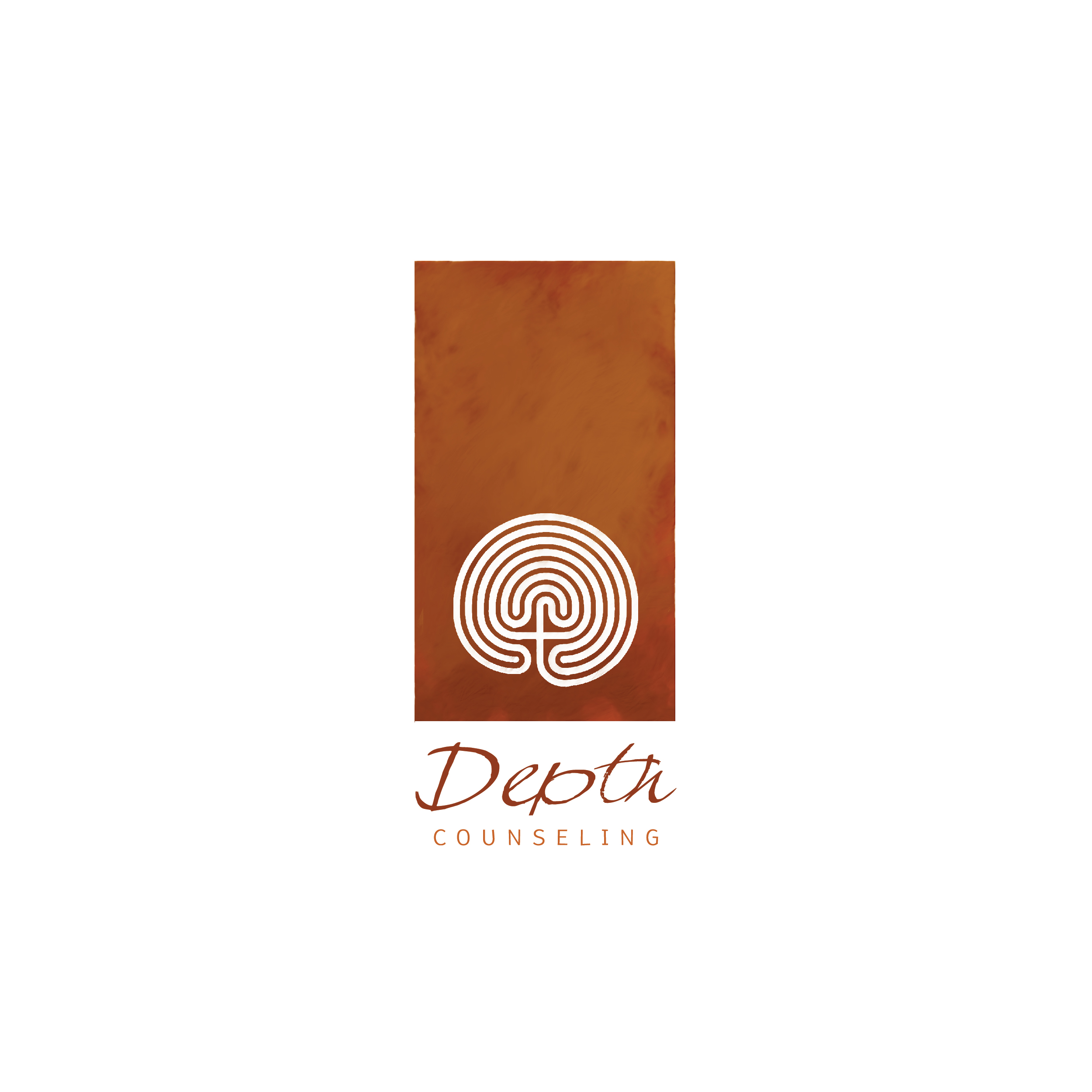
CASE STUDY: Depth Counseling
Thanks to my dear friend Jenna for recommending me to her colleague Gregory Rizzolo to create a logo, a website, photography for the website, and business cards for their new therapy group Depth Counseling.
When asked what sets Depth Counseling apart from other options in the Chicago area, Greg responded:
Depth Counseling is unlike other practices in that it takes a "psychoanalytic," or "psychodynamic," approach to mental health problems. This approach is unique in its focus on emotion, the exploration of avoidance (e.g. how people avoid distressing thoughts or feelings), developmental history and interpersonal relationships. I named it "depth" counseling because we try to go "deeper" into the presenting problems than do more conventional advice-giving therapies.
I would like for [the logo] to be clean, but not cold. Ideally something that signals: "we are friendly professional people and our clients matter to us."
Based on this brief, I knew I wanted the logo to have an organic, hand-painted look while remaining clean and inviting. Some research into websites for similar practices revealed some clichés that I wanted to avoid: human silhouettes, saccharine optimism, and beautiful but unrelated landscape photography among them.
1. The Logo
While hashing out these initial ideas, I quickly became excited about the idea of the meditation maze as a motif that could appear elegantly in the logo and the photography for the website.
This resonated with Greg as well—he liked "the last one a lot," and "sas wondering if you could make the text slightly bigger, while keeping the same basic look." He sent me some other labyrinths to work with, and I came back with these variations, calling attention to the resounding 'D backwards C' in the intitial version:
2. The Photos
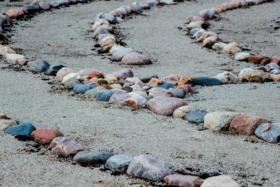
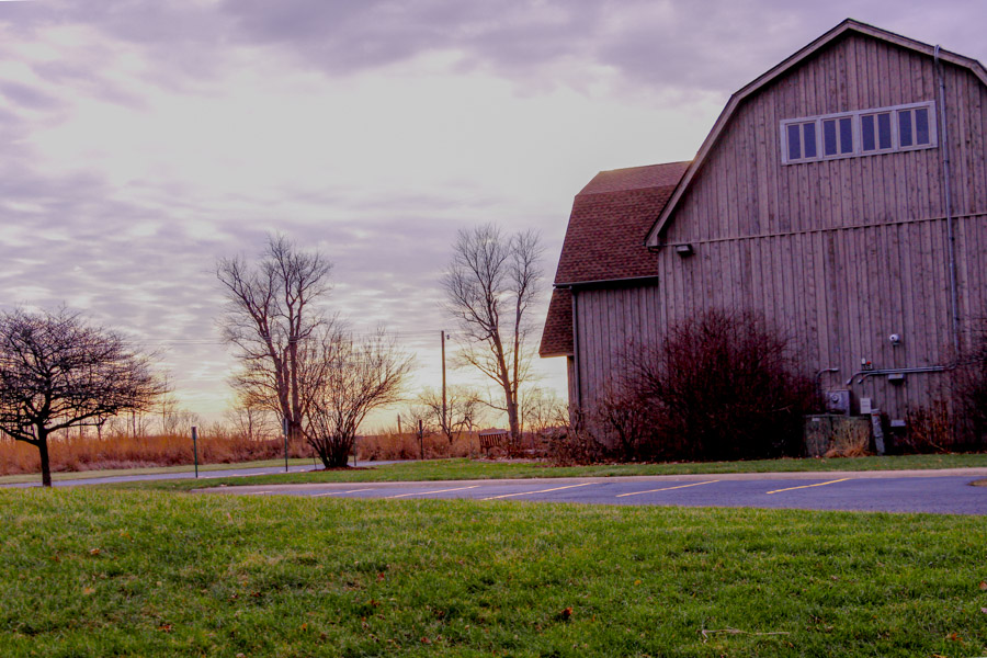
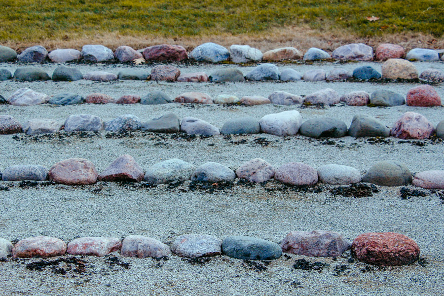
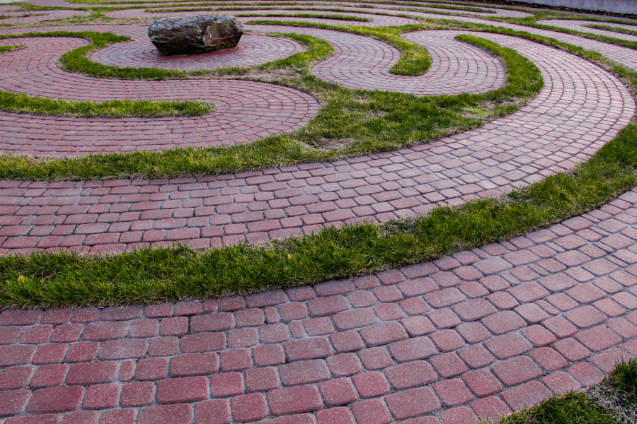
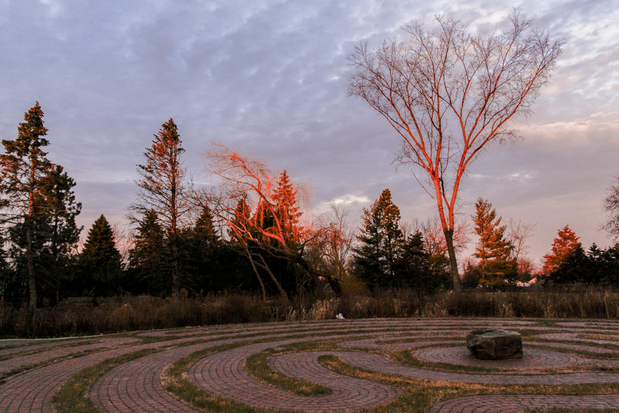
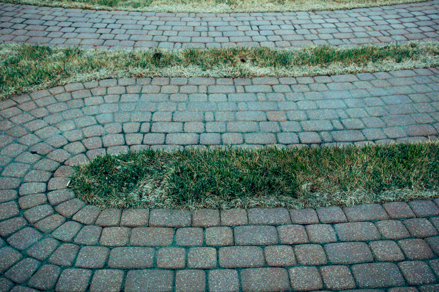
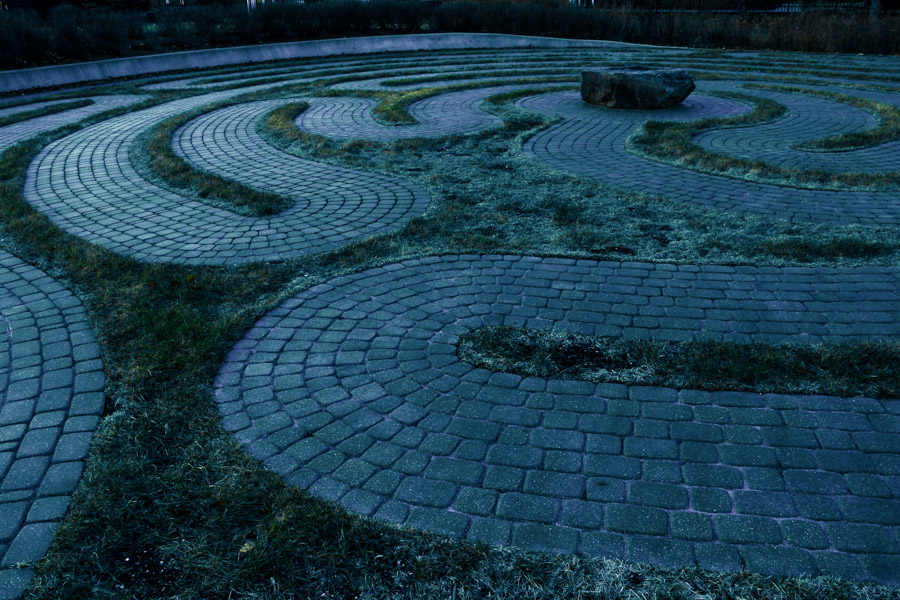
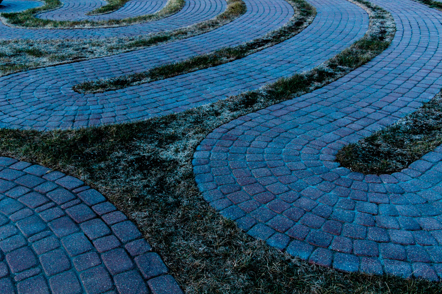
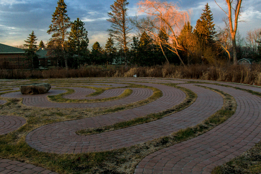
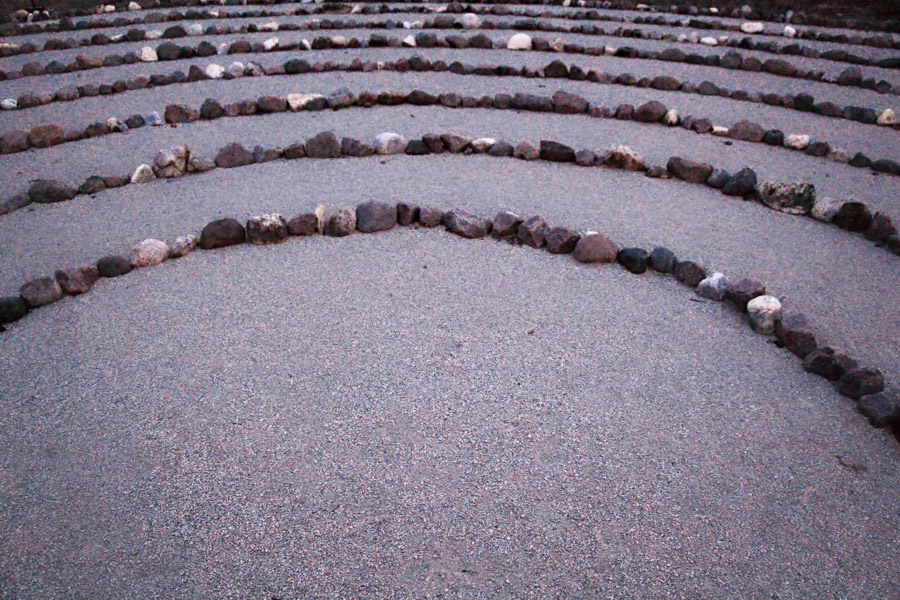
It ended up being a no-brainer that I should photograph some actual meditation mazes for use on the website—but where to find them? I knew of one at Garfield Park Conservatory, but when I went to visit it, it was closed off for some winter maintenance. I later made a bizarrely specific discovery: a directory of mazes in the greater Chicagoland area published by a group in Barrington, IL called Relax4Life. This discovery seems even more auspicious now that I've discovered that they've since taken the directory down during the course of a website redesign. Thankfully, the Wayback Machine has this archived. Looking for mazes? Look no further than here.
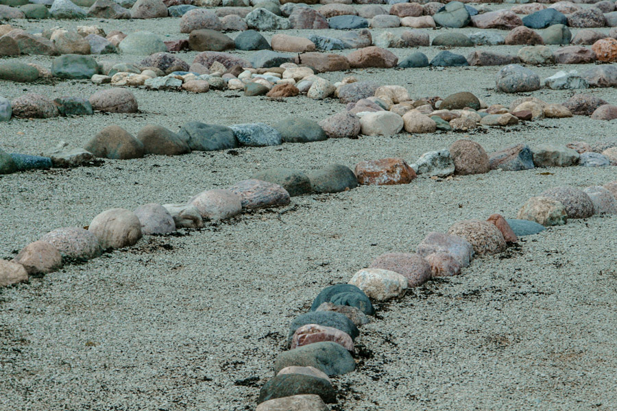
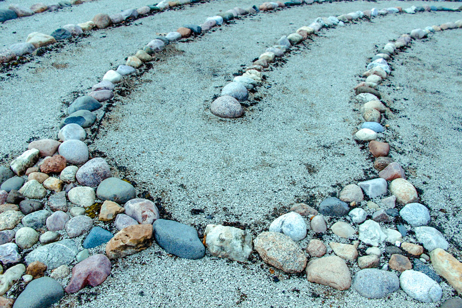
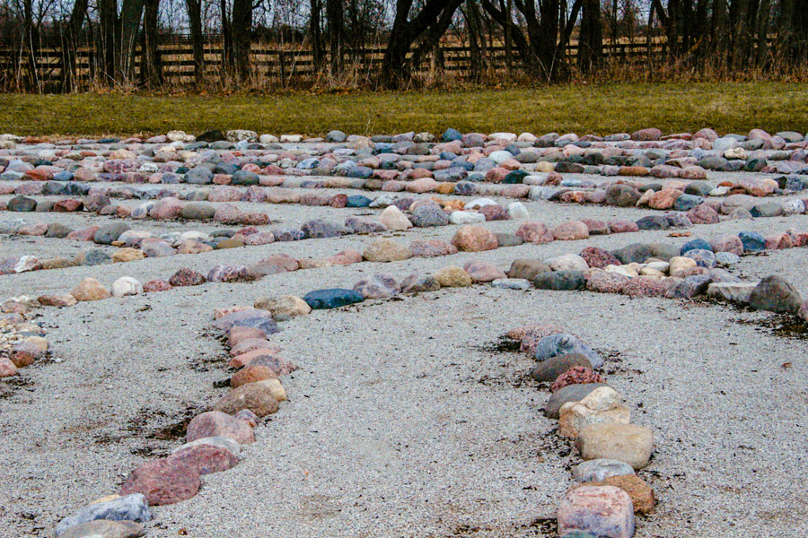
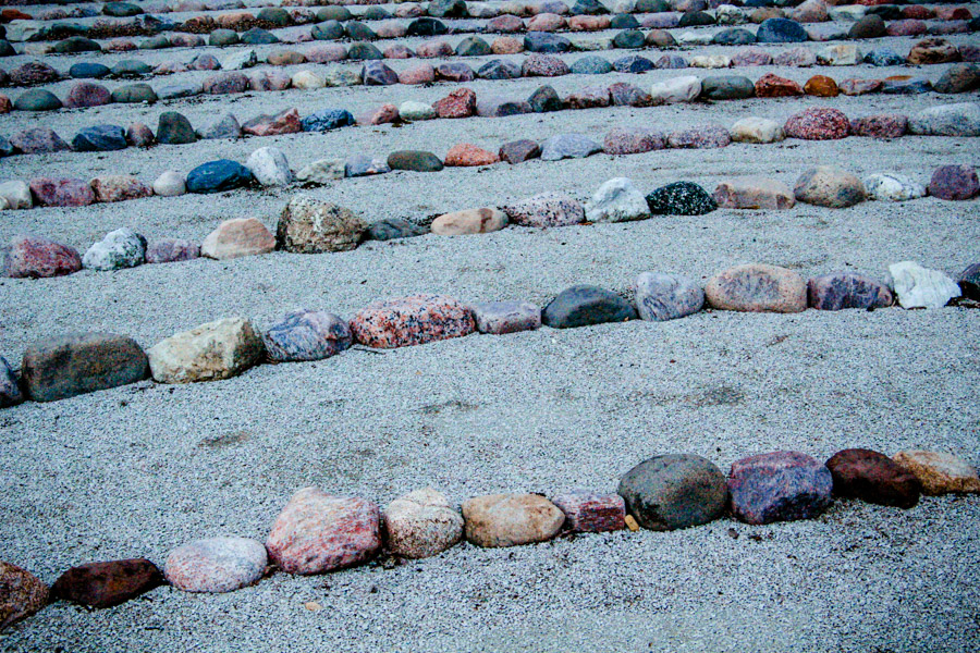
On a cold, short December day, I packed up my camera & gear and drove around photographing mazes in Elgin, Prairie Grove, and Lake Zurich, IL. I was experimenting with some new HDR software and extreme tonal adjustments while processing the images.

3. The Website
For sheer ease of use and intuitive content management, you can't go wrong with Squarespace. I picked their 'Moksha' template, as it features the photography nicely with its 'parallax' scrolling of background images.
I'm very happy with how the whole thing came together. Check it out at depthcounseling.org.
4. The Business Cards
The final bit of business was designing business cards for Jenna and Anancia, the other therapists in the group.


