

"Cobalt, Red Oxide": My First Commissioned Painting
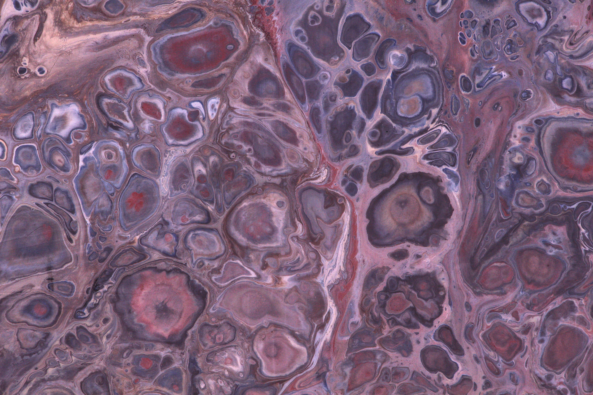
Dan Mohr, Cobalt, Red Oxide. 2019. Acrylic on Porcelain. Diptych, each panel 18” x 36”.
If you’ve been following me on Instagram, you probably have the impression that I’m a full-time painter. Since taking it up in July, I’ve been making a lot of paintings and posting many on the ‘gram. Inspired by these posts, an old roommate of mine reached out to commission me to make a larger-format work to be displayed in his new office. He is a psychotherapist, and has opened his practice in a building overlooking Grand Central Station in New York City, and wanted a piece that would sustain extended examination by his patients during their sessions.
[I] would love something earthy and organic w deep blues and reds, but perhaps also some color to pop. Basically something that would evoke the complexity and ever-unfolding detail of dream life, with intricate detail, unexpected swaths of color/effects. Something that might challenge the viewer but can also hang in the background in an alluring but also comforting way.
After a few false starts, I started zeroing in on a paint recipe I liked, with a viscosity high enough that cells would be tight and well defined, when not being melted by a generous amount of 3-in-One All Temp Silicone. Working with the requested color palette proved a little tricky; red and blue have a lot of connotations when they interact—I wanted to avoid obvious binarism or patriotism, so I ended up tinting the blue with green and using the rusty red oxide to skew their relationship, while adding neutrals like raw sienna, a yellowish beige, and a minty celadon to make what would be a primary color relationship more complex/organic.
Here are some early studies:


I could have gone in a few directions as far as the final composition of the diptych; one panel could have been red, and one blue, as in the first example; both panels could have both red and blue—either overlapping as in the second example, or pressed against each other but not intermingling as in the third. My friend expressed a preference for the overlapping option, and I really liked how the monochromatic palettes looked too, so I established a plan that would allow for all of these to exist.
I would fill three cups, layering paints in the same order in each. The left cup would contain cobalt and the auxiliary colors; the right would contain red ochre and the auxiliary colors; and the center cup would contain both. I would then repeat the process for the second panel, hoping that the procedural consistency would make the two panels seem related as components of one artwork.
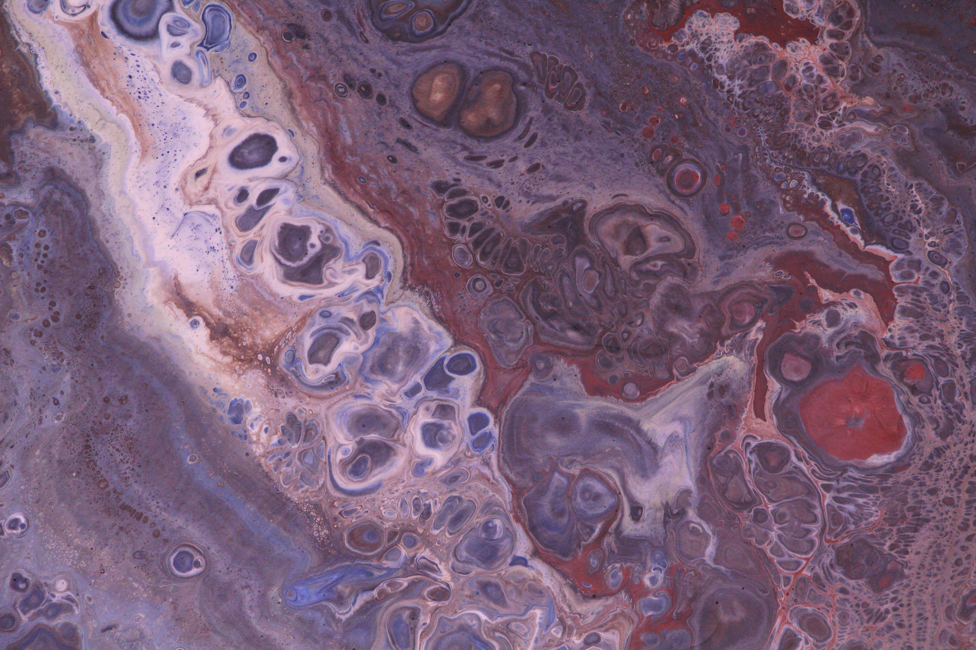
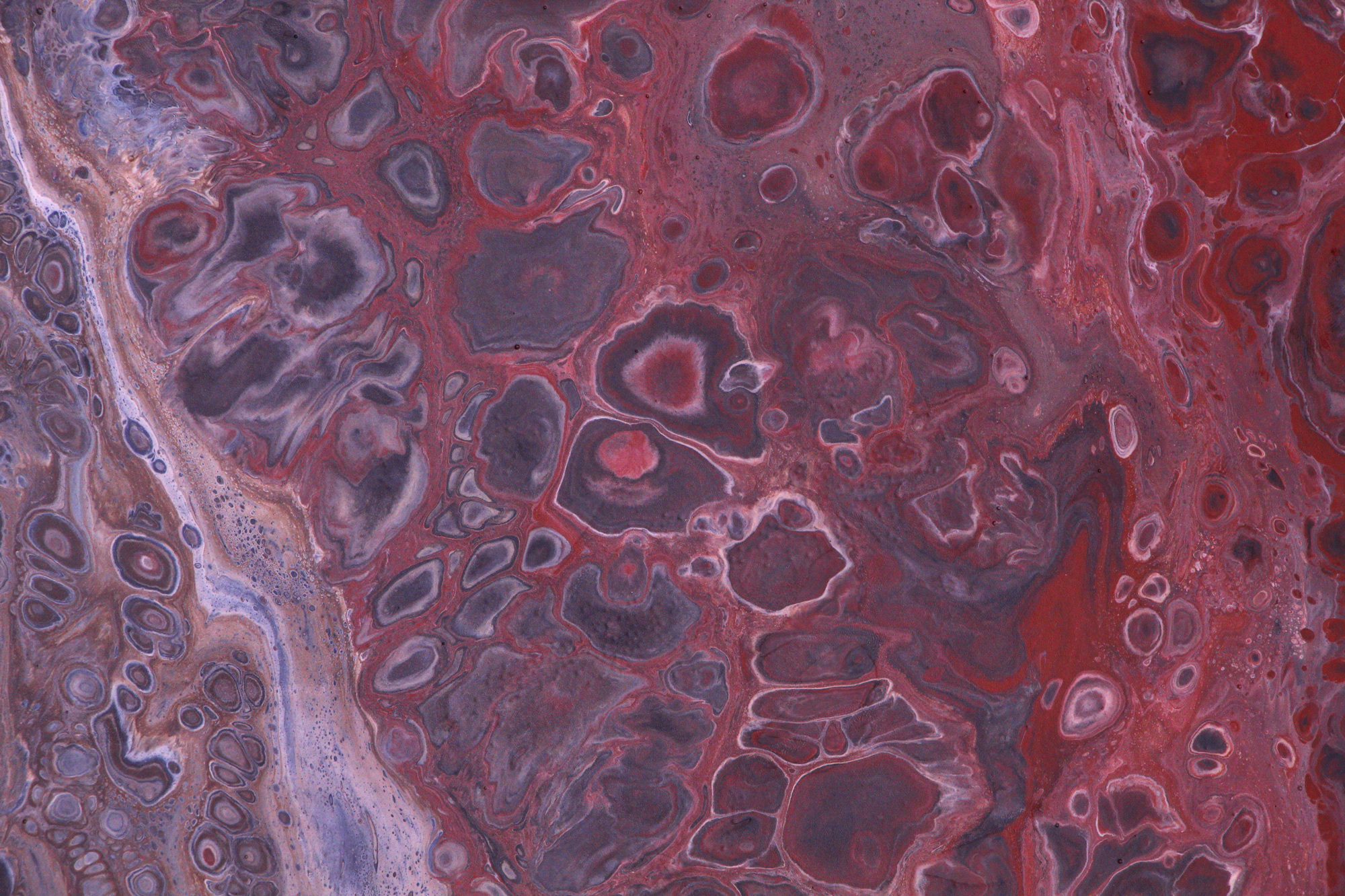
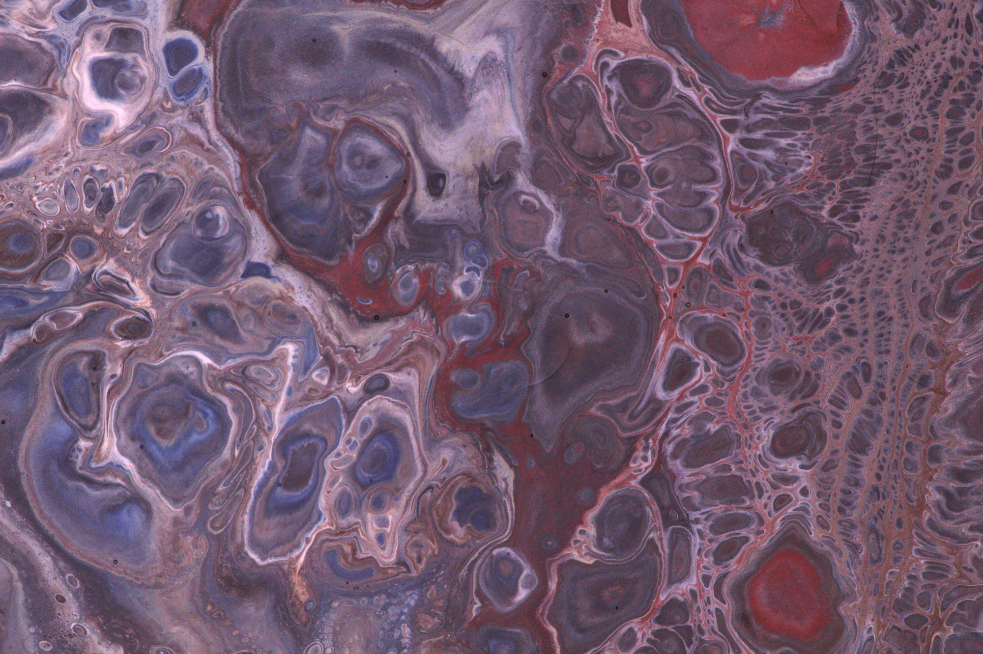
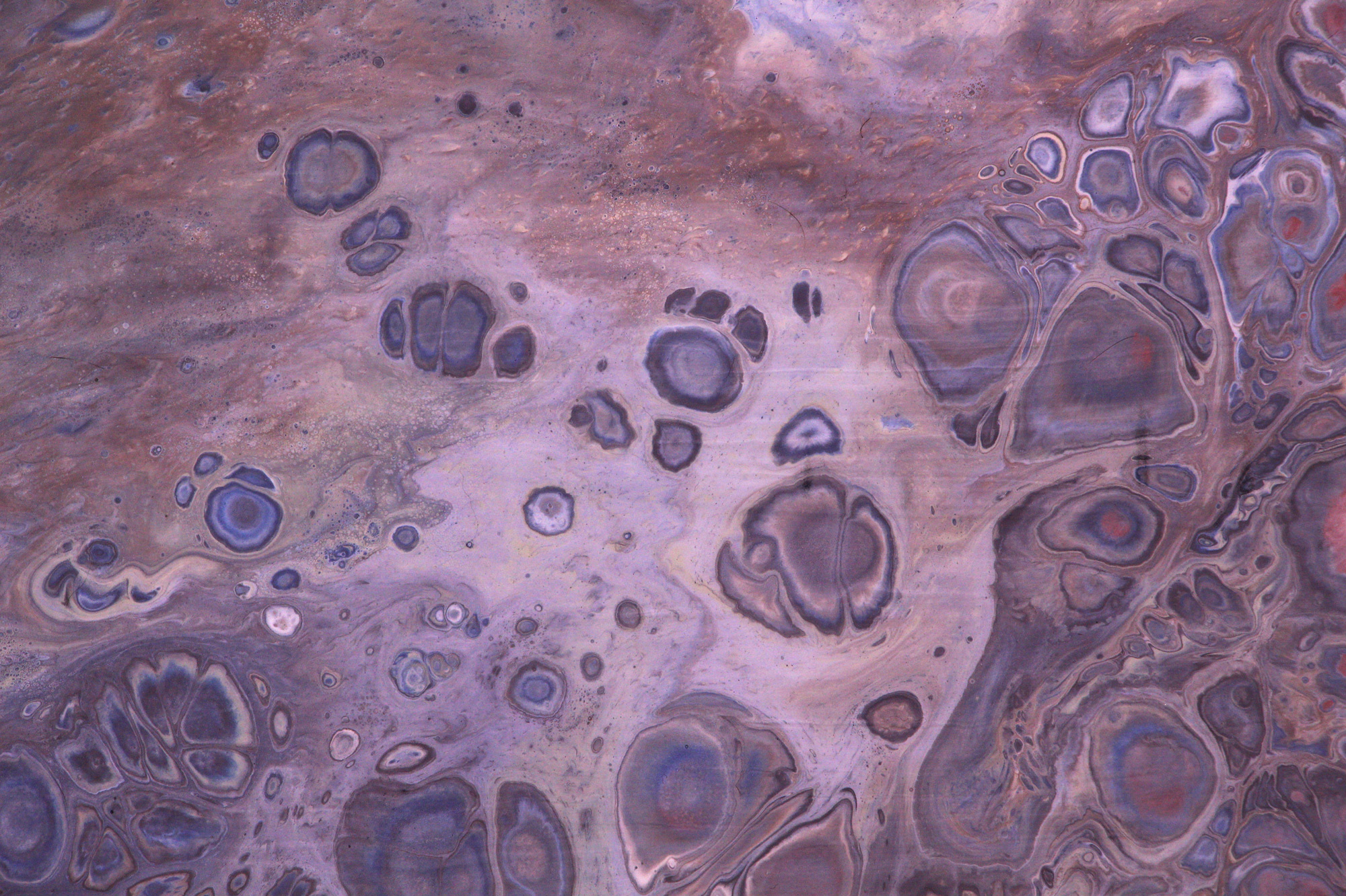
After so much planning, I had a certain amount of anxiety actually executing these pours, which were larger than anything I had theretofore attempted. While this process is always unpredictable, I was pleased with the outcome, as it represented what both I and my client had in mind. The textures are incredibly detailed and varied, with fat melty silicone cells yielding to areas of tight lacing, and the larger picture flows from one panel to the other nicely.
I finished the pieces with a few coats of satin polymer varnish, which keeps the color lightfast and provides an intriguing, almost fleshy sheen.
Here are some details from the finished pieces:
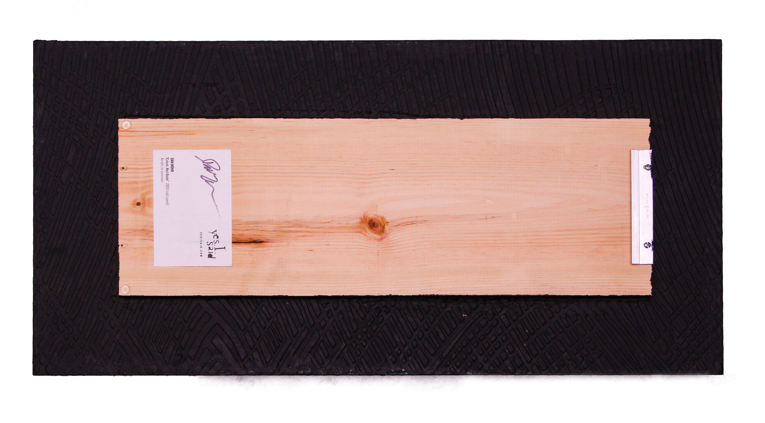
The final hurdle was to figure out how to mount and hang them, which seemed like kind of a tall order, given that each panel weighs about 26 pounds.
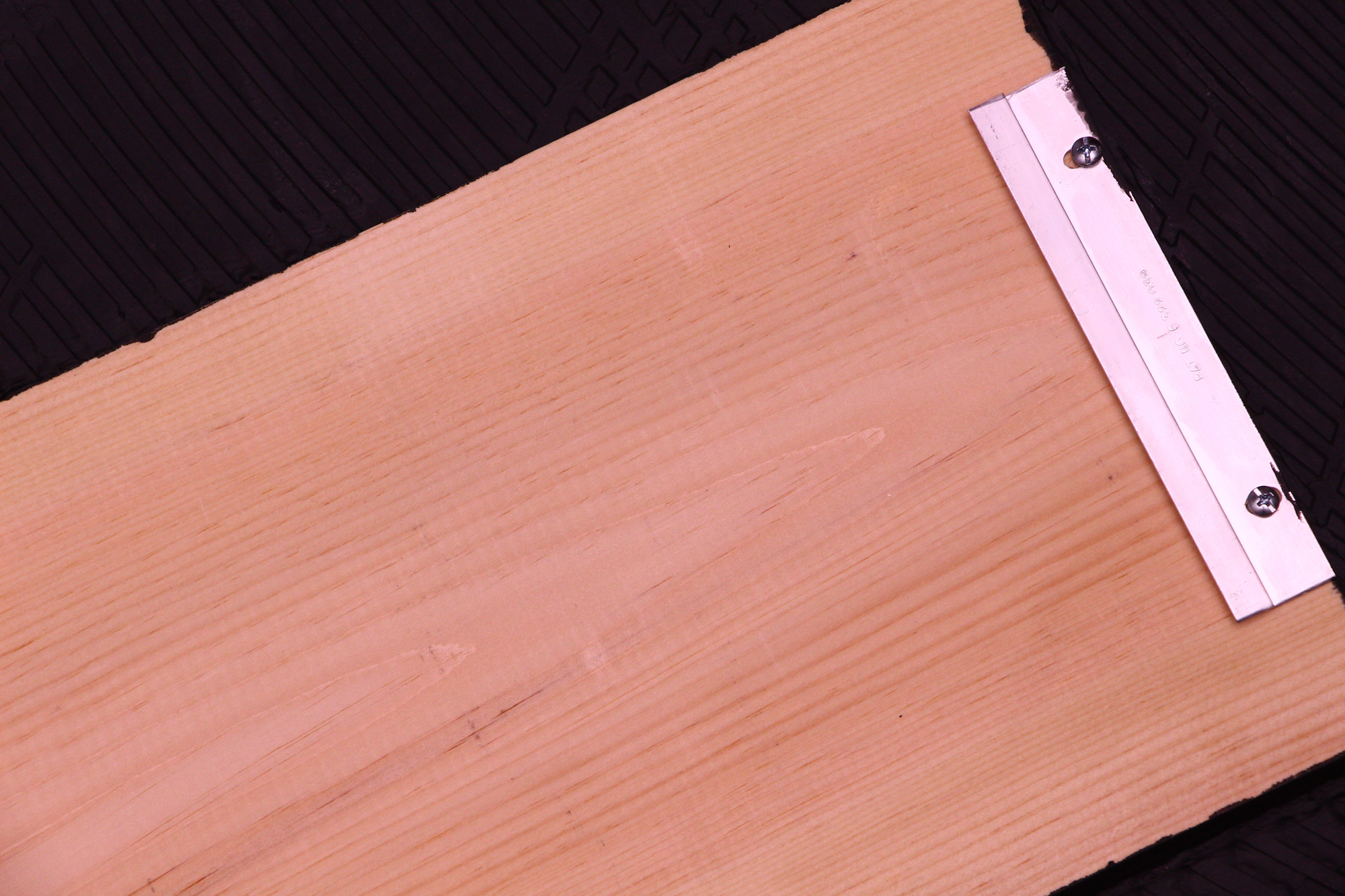
I designed a solution: I would use industrial adhesive to affix a wood plank to the back of each tile, and use a french cleat to mount the pieces to the wall. This has many advantages: the cleat affixes to the wall with two drywall anchors, which seems pretty minimally destructive given the heft of the things; the hanging mechanism is adjustable on both the paintings and the wall, so leveling them is a cinch, and one could even change the orientation of the pieces from portrait to landscape if one wanted a fresh perspective; and the board suspends the tile away from the wall, giving a pleasing float to the installation. I painted the sides and back of the panels a matte black to make them pop away from the wall even more.
This all worked like a charm, and I’m sure I’ll be replicating it on many pieces in the future.
I packed the paintings up in sleeping bags and cardboard boxes, said an atheist prayer and gave them to the mercy of UPS Ground shipping. Sure enough, UPS misplaced these singularly irreplaceable items for a number of days before they finally reached their home on 42nd Street.
I have a few more of these giant tiles; if you’d like to commission a piece, don’t hesitate to contact me.