CASE STUDY: Middle Branch Partners
Late last year, Chuck Weikel and Larry Barr reached out to yes.I.said about creating a logo and a website for their new financial advisory Middle Branch Partners. They were colleagues at another firm, and were on the brink of branching out on their own in early 2019.
They came to me with the company’s name, which originally referred to the middle fork of the north branch of the Chicago River—a modest river flowing through beautiful forest preserves in the northern suburbs of Chicago. They wanted the brand to stand out amidst the competition (they work primarily in the Medical Technology sector), and to have a clean, European appeal in order to cater to their transcontinental clientele.
Inspiration
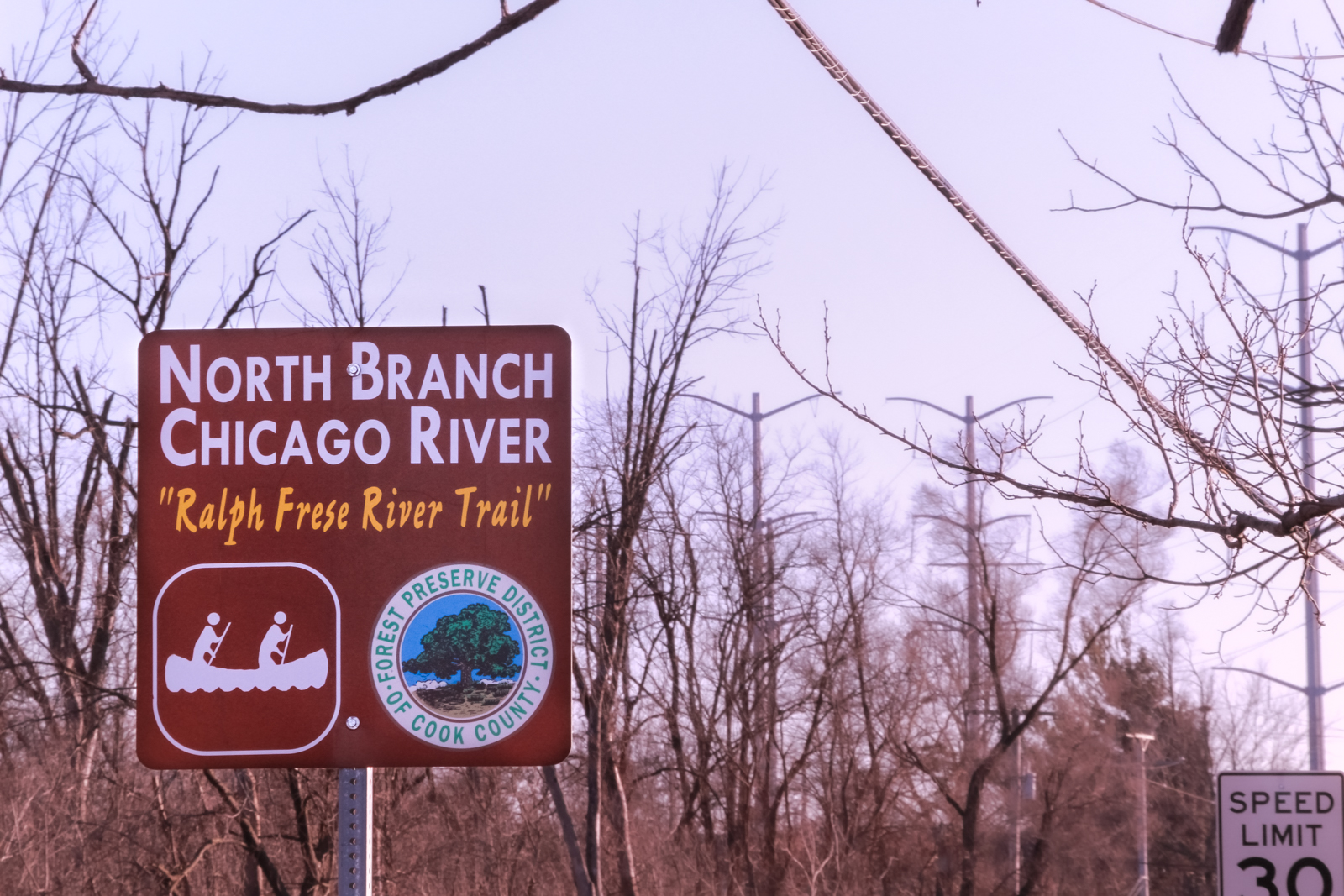
I took a trip up to the river in question for inspiration, and to snap some photos in case a photographic representation became an element in the branding or website design. Here are some of the photos I took:
The Logo
Initial logo concept from the clients
As is my standard practice, I presented three different concepts to the clients. All three used a branching river as their jumping off point.
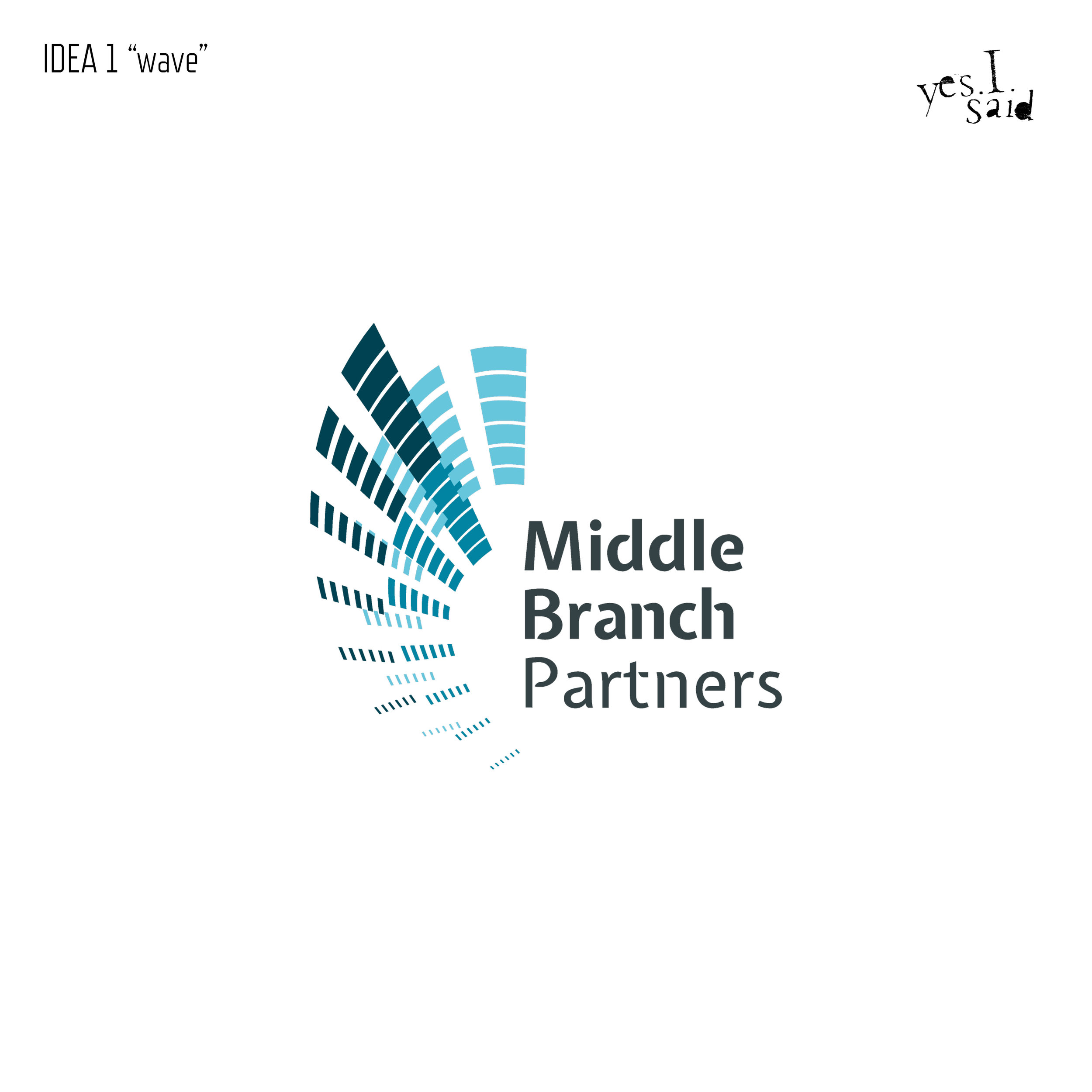
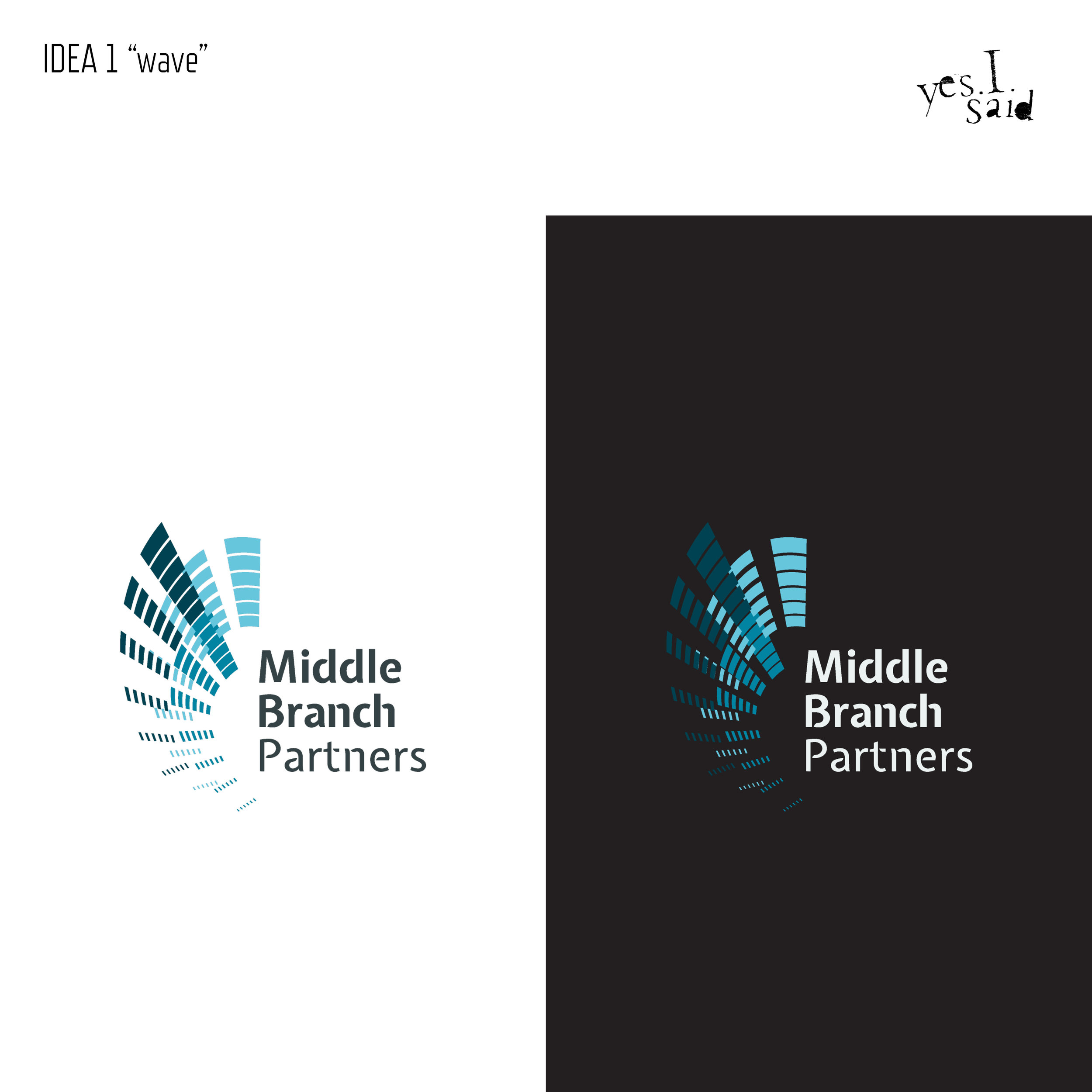
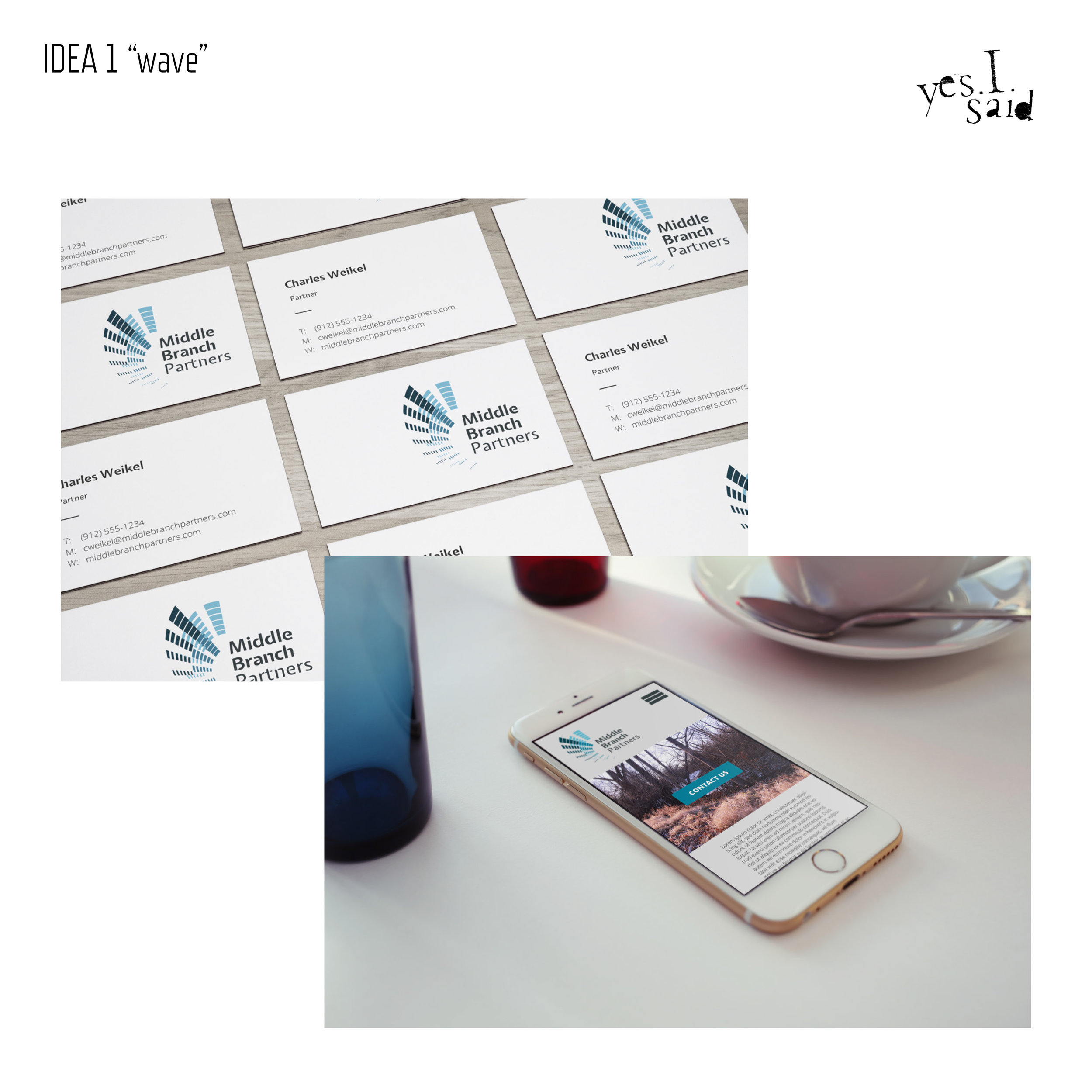
IDEA 1: ‘Wave’
This one was the most ‘corporate’ of the three, depicting three overlapping currents in an aqua palette.
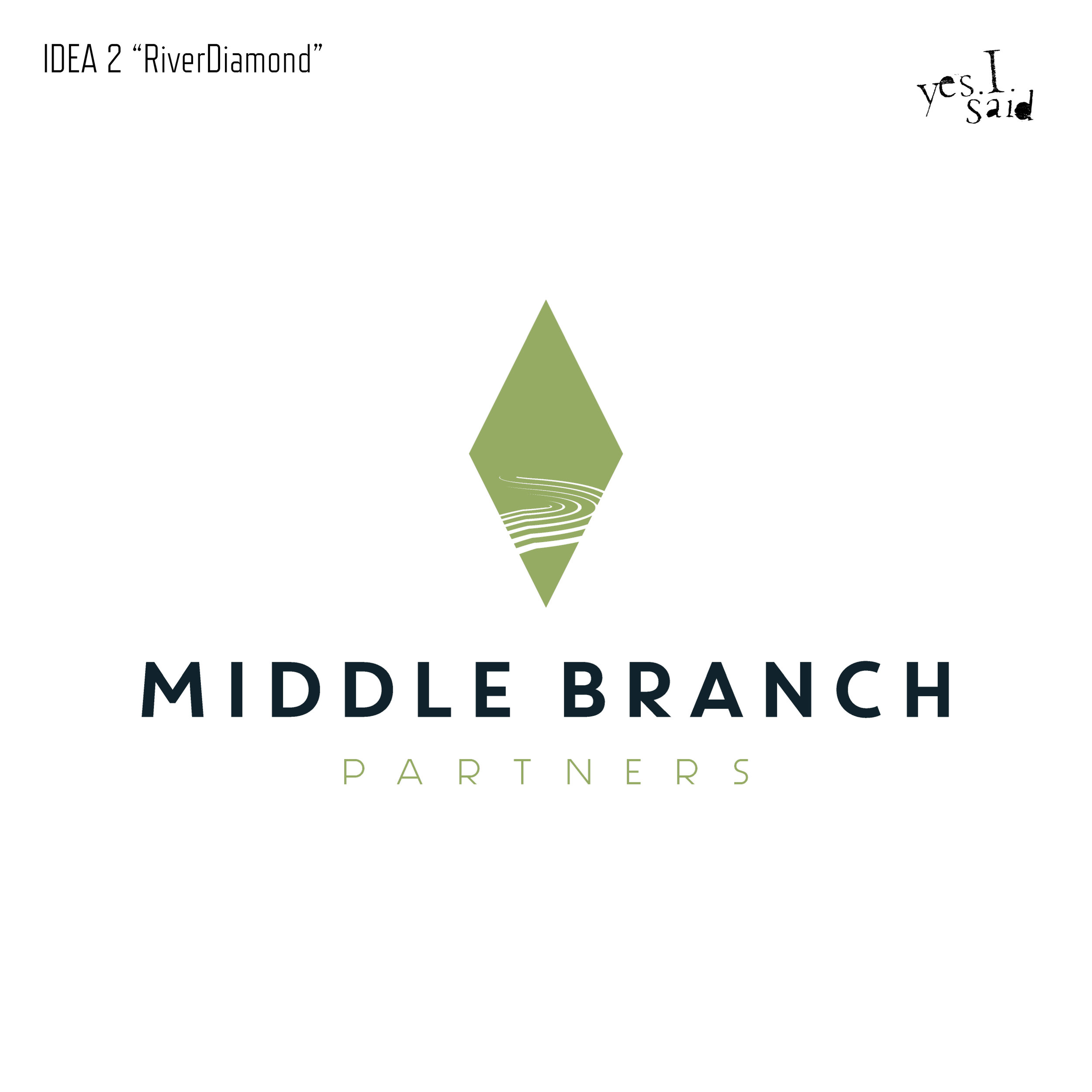
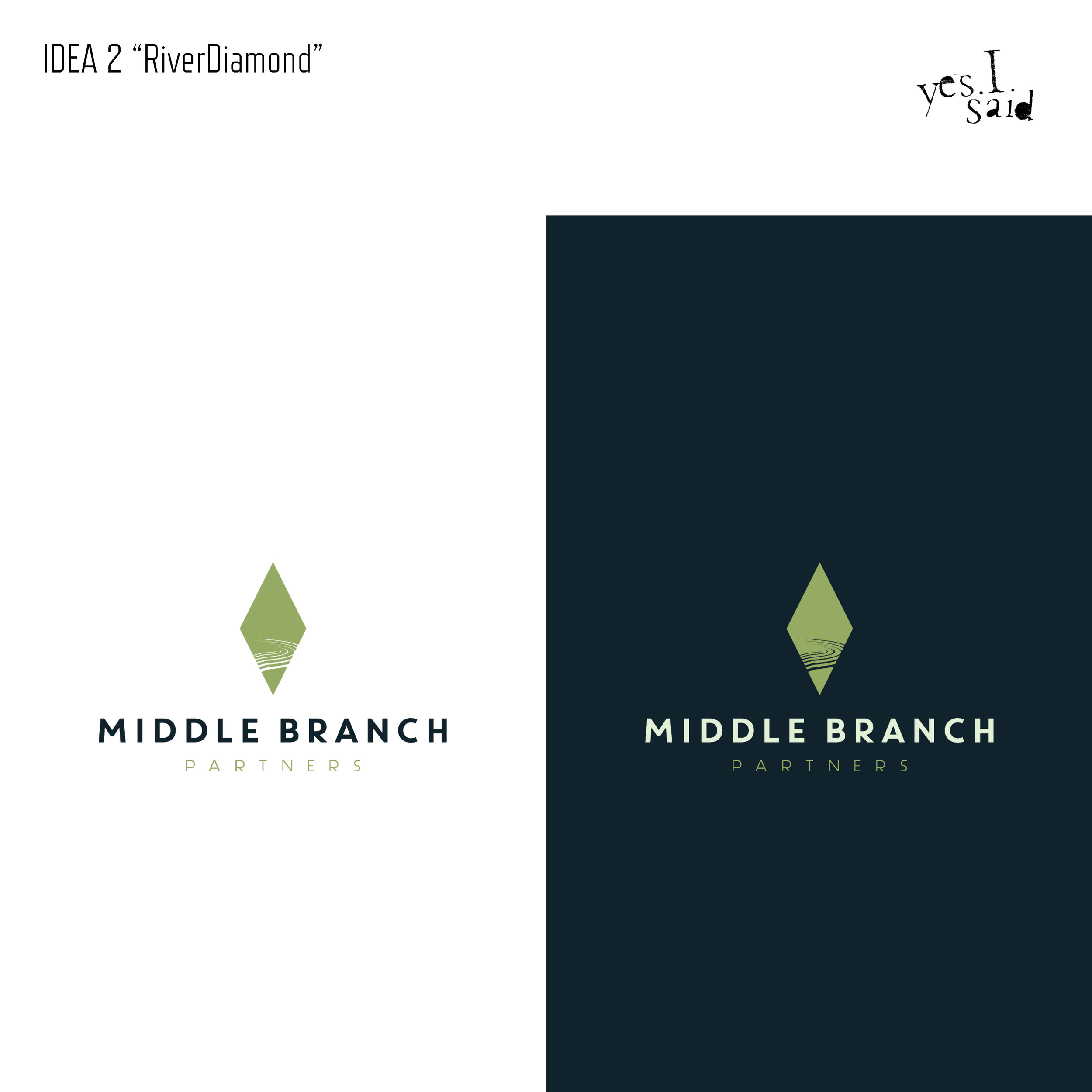
IDEA 2: ‘RiverDiamond’
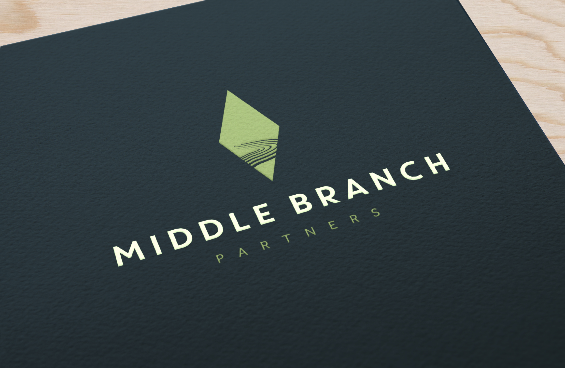
I felt like this one would resonate most with the clients, it being closest to the initial concept they submitted. I was excited about the matcha/navy color scheme.
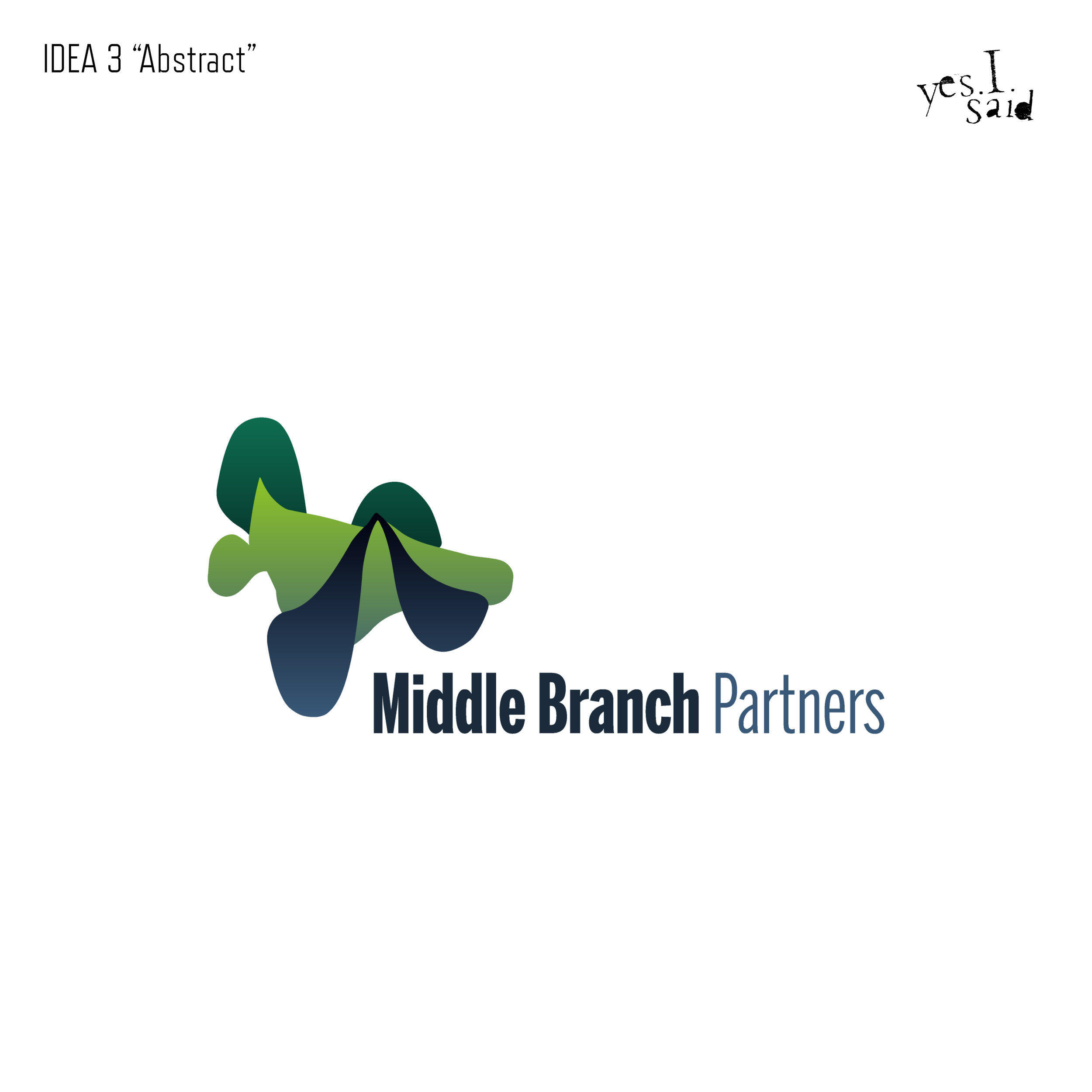
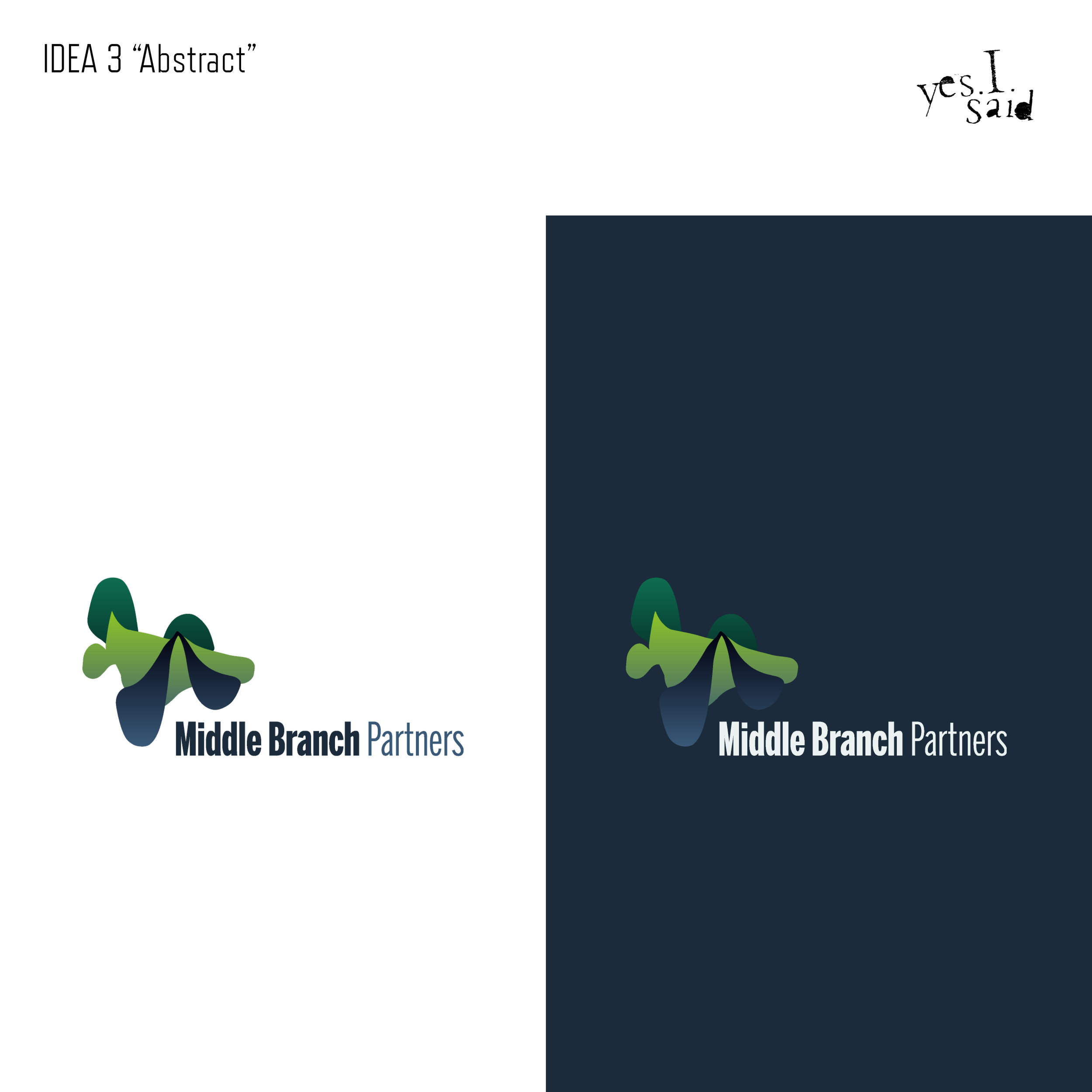
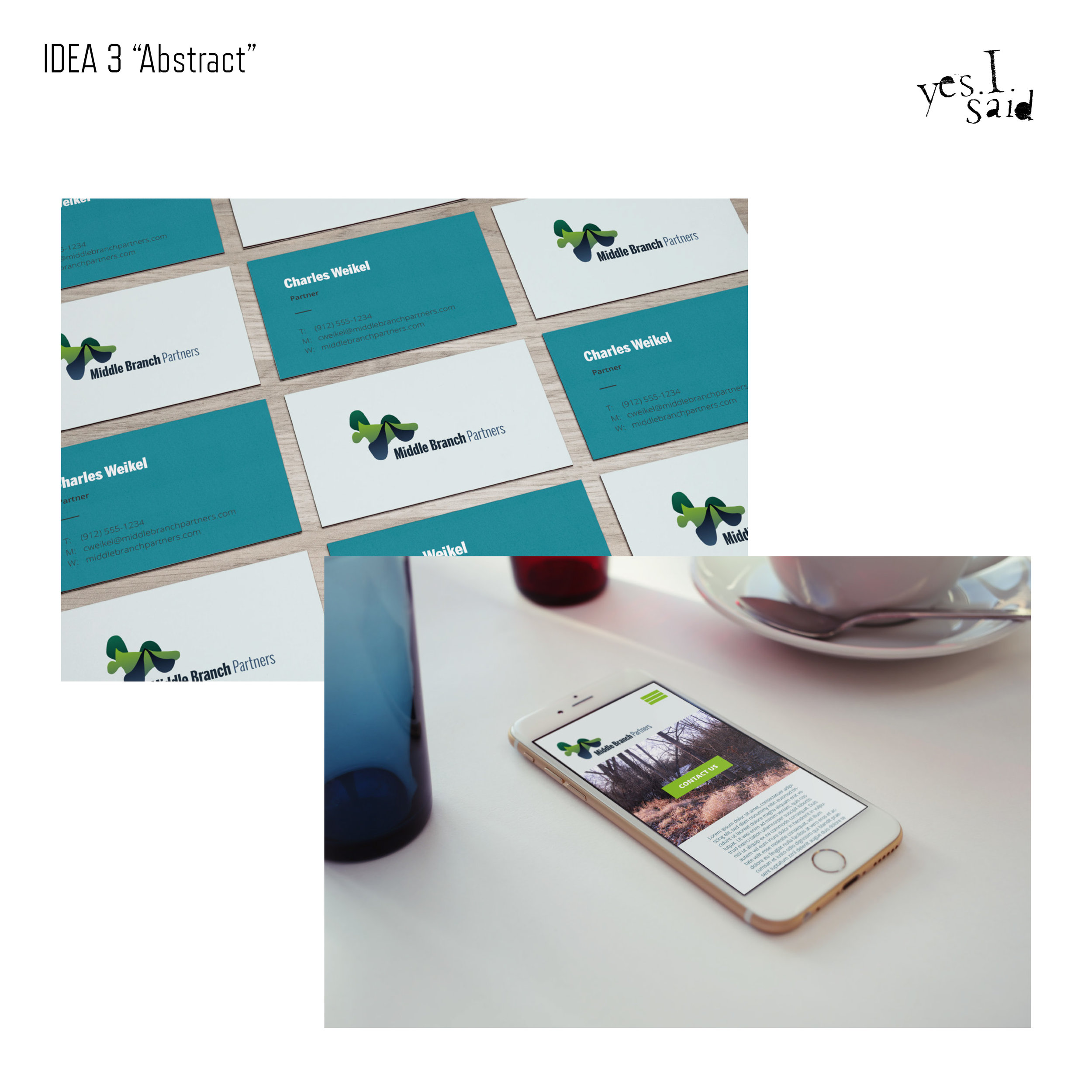
IDEA 3: Abstract
I used envelope warps on simpler shapes to create an abstract landscape that suggests a confluence of rivers. I liked the playful colors, and thought it met the ‘European’ aspect of the brief.
In the end, my instincts were correct, and we opted to pursue the ‘RiverDiamond’ option, with only minimal alterations.
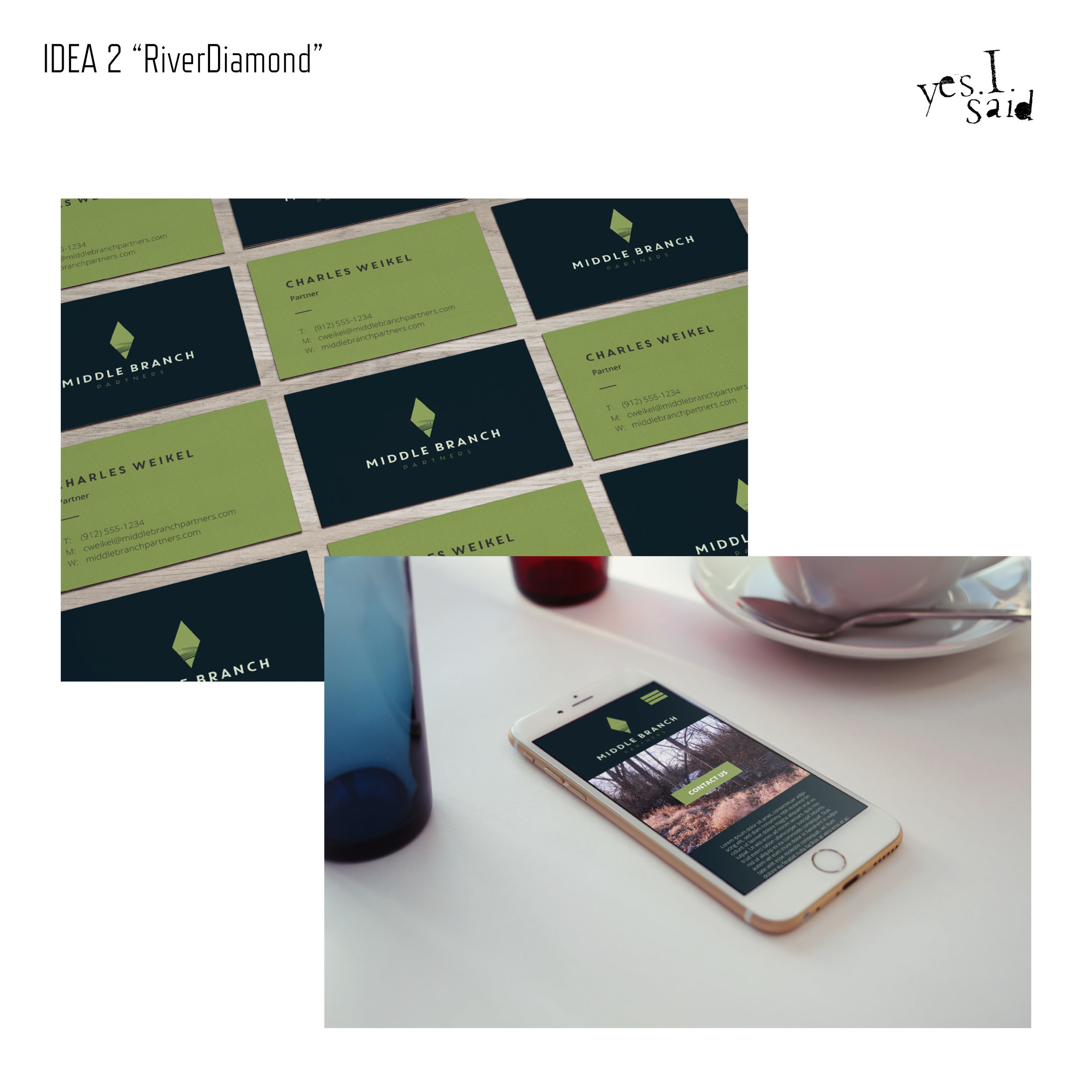
The Business Cards
Not much to say here—the clients went for the first submitted design. We printed these on ultra thick stock with a black painted edge.
The Website
I set an intention of making the MBP website stand out from their competition. Most of the identity designs of other similar firms have simple light backgrounds with rigid geometric design accents; I opted to give the site a rich, navy background with green tea and sapphire accents, with fluid swoops behind the bold headline blocks on each page. Since the website launch in March of 2019, this diversion from the norm has proven to be a successful strategy.


