Creating an isometric illustration for the International German Olympics (IDO)
Long-term client Goethe-Institut recently hired me to create an illustration for the 2022 International German Olympics (IDO), a biennial international scholastic competition and cultural exchange for students studying German. Sixteen students and their teachers traveled to Chicago at the end of the year for the national finals. The winners receive an all-expenses-paid trip to Hamburg, Germany for the International Finals in summer 2022.
The illustration was to be printed on hoodies and other collateral as uniforms/souvenirs for the participants.
Goethe provided the following image along with their brief for the project:
Nature vector created by freepik - www.freepik.com
Something like this graphic, but on the left the Chicago skyline (Sears tower, hancock, maybe a little hot dog?) and then across the ocean same idea with Hamburg.
Text on the top (in our font) ZEIG DER WELT WAS DU KANNST! (“Show the world what you can do!”)
It would be great if we could incorporate the ido and GI logo somehow.
We will use this graphic to print on sweatshirts etc. so no background needed.
What is isometric design?
I took this job as an opportunity to learn how to create an isometric illustration, a popular style that came out of the trend of flat design, and has been widely used in illustrations and infographics over the course of the past decade. Etymologically, the word isometric comes from the Greek for ‘equal measure’; the technique is a method of creating three-dimensional representation within two-dimensional space by putting a 120° angle between the x, y, and z axes. One could define it as false perspective, because in an isometric design, parallel lines never intersect, whereas in true 2- and 3-point perspective technique, parallel lines converge at vanishing points.
The first sketch
Before I got going on the final illustration, I created a rough sketch in Photoshop to make sure the client and I were on the same page. This would allow me to create a provisional layout without all of the grid work and technical aspects involved in creating true isometry.
This is what I came up with, and the client’s feedback in response:
The first sketch of the illustration
I love it! We all love the balance and overall layout. Especially the food trucks are a huge hit! Exactly how I imagined it!
Here is the feedback I gathered:
Move font a little higher so that it does not touch the font [sic]
Make hancock a little smaller
Bean instead of millennium park pavilion
Our current intern has lived in the Hamburg area so she has some insight on the “real” icons there:
Elbphilharmonie looks great and your rendition is immediately recognizable
Any way you could fit a river in there (or in Chicago too?) not a big deal if not
Hamburg has one less structure than Chicago – suggestion would be a container ship and/or crane likethis or this or this
The most iconic bridge in Hamburg is the Köhlbrandbrücke could you switch the bridge in the back for that (or leave that bridge as it is and use the new bridge on the hamburg side…but idk if that’s too many bridges…or omit the “connecting” bridge? Whatever you think works)
Creating the final illustration
Now, it was time to hunker down and create the final illustration based on their feedback. I created an isometric grid to which all of the architectural objects would adhere, and began to reproduce the initial sketch, incorporating the client’s feedback and using Goethe’s brand colorway.
Detail of illustration with isometric grid overlay
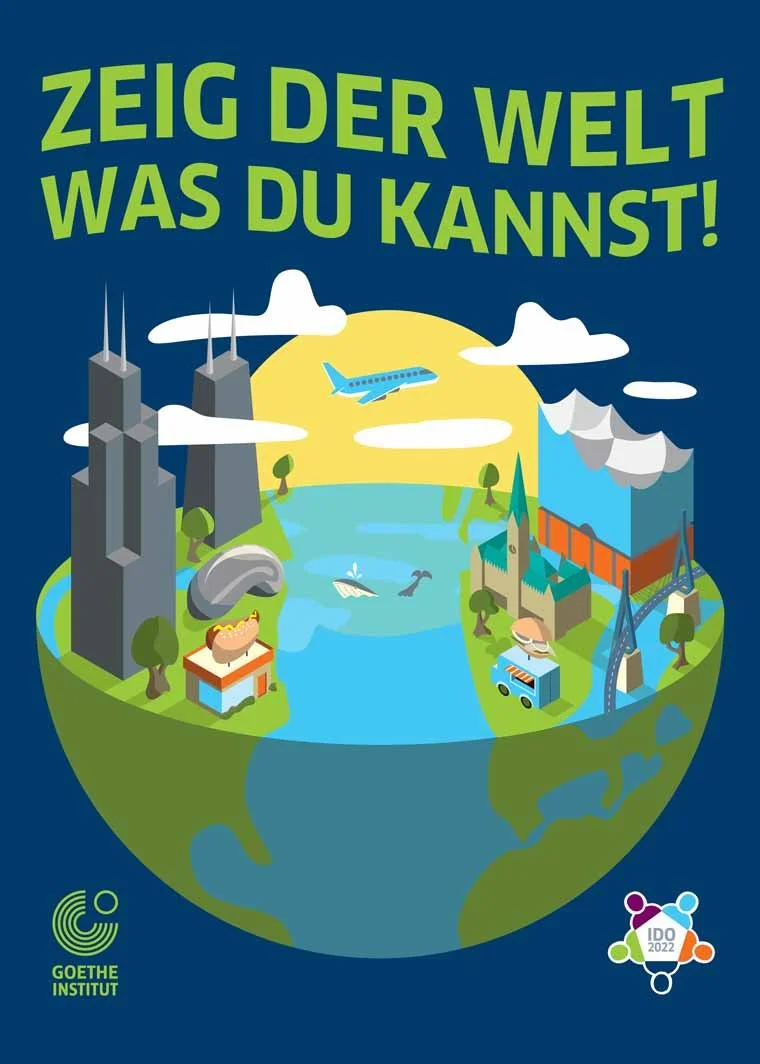
I started with the Chicago side of the semisphere. The Hancock and Willis towers were relatively easy to create, given their modernist, rectilinear nature. The more freeform depictions of Cloud Gate (‘The Bean’) and the hot dog stand’s sign were a bit more challenging.
Across the pond in Hamburg, however, things were at a much higher level of difficulty. The complexities of Swiss architecture firm Herzog & de Meuron’s Elbphilharmonie building—especially its slanting, swooping, spiked roof—gave me a considerable amount of grief. The late 19th-century architecture of the Hamburger Rathaus (Hamburg Town Hall) presented different challenges related to the level of detail I could include or omit to make the building both recognizable and in keeping with the minimalist style of the illustration. Fitting the Köhlbrandbrücke into the picture required strategic placement of a river, and the creation of a road that convincingly spanned its towers.
To pull everything together, a bright yellow sun rises in the center of the picture, creating isometric shadows cast by all of the objects, and creating a light source that assisted me in making decisions about coloring the piece. I drew freeform trees on both sides, a plane in flight through the clouds from Chicago to Hamburg, and a whale breaching in the ocean.
The final product
After I put all the finishing touches on the piece, I delivered it to the client, and they were thrilled! After just a few tweaks here and there, we were set to print. Regrettably/inexplicably, they ended up printing the graphic on white hoodies, diminishing the appearance of the clouds.
Do you need a creative illustration or infographic for your next campaign? Don’t hesitate to contact me for a free consultation and quote.
The final illustration, on a dark background (as intended)
A mockup of the design on a dark blue hoodie (as intended)
Chelsey Gilbert (Monroe High School, WI) and Lauren Guo (Ralston Valley High School, CO), winners of the US National Finals of IDO 2022, wearing the final product. (Image courtesy of Goethe-Institut Chicago.)


