EXERCISE: Perspective Apparel
I’ve been mulling various strategies of creating digital and/or print-to-order products in addition to my client work (though finding the time to do so has proven difficult).
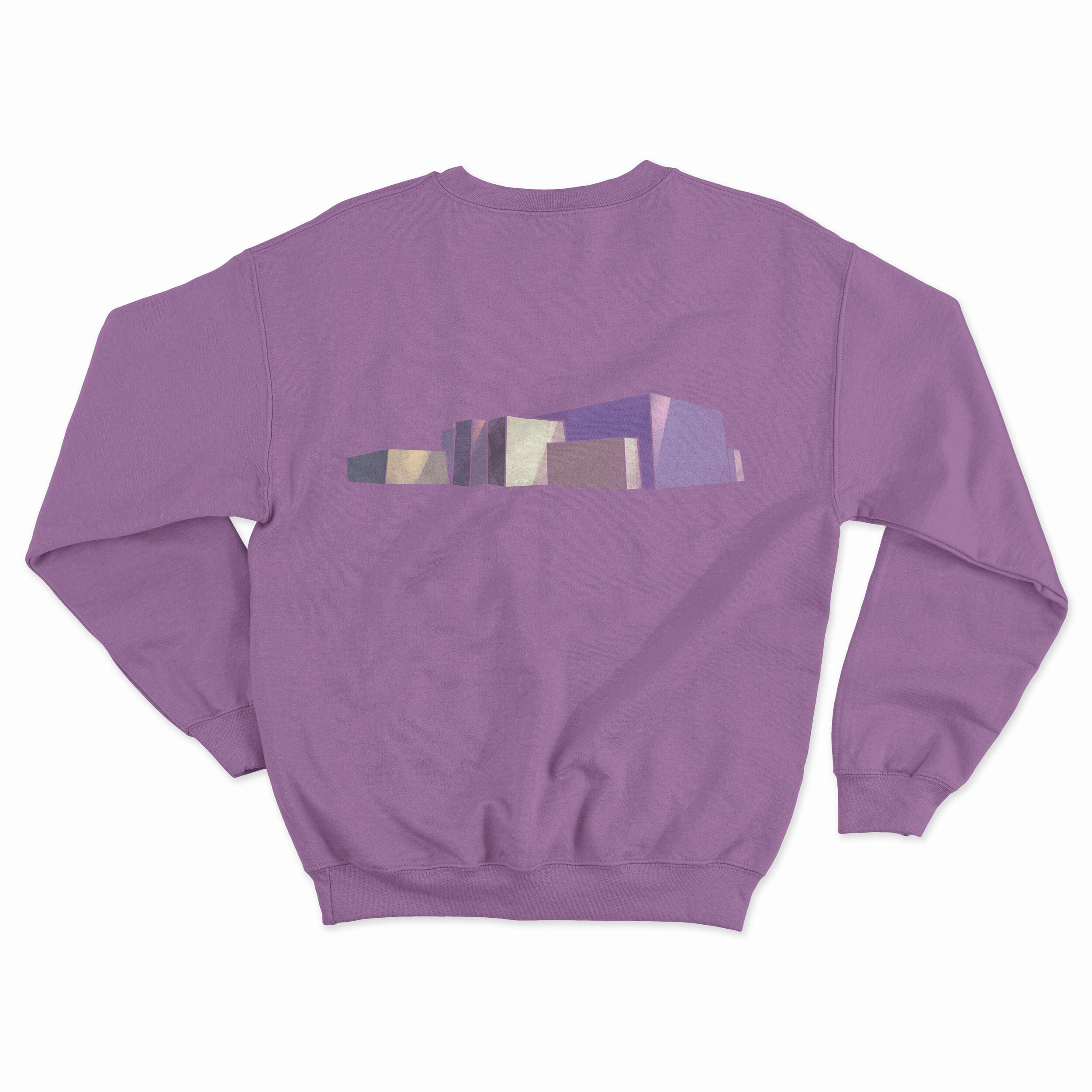
One of my favorite projects in junior high art class was drawing in two-point perspective, and I’ve often thought about revisiting perspective drawing techniques as an adult. These fantasies were reignited recently when I decided to convert a photo I took of a utility building (located at the fringes of Lincoln Park at Wilson Avenue in Chicago) to abstract geometric artwork.
The original photo
The artwork
I didn’t use any perspective techniques to create the above; rather, I just traced the photo in Photoshop. Inspired, I reacquainted myself with vanishing points and perspective techniques, and created three additional pieces in one-, two-, and three-point perspective.
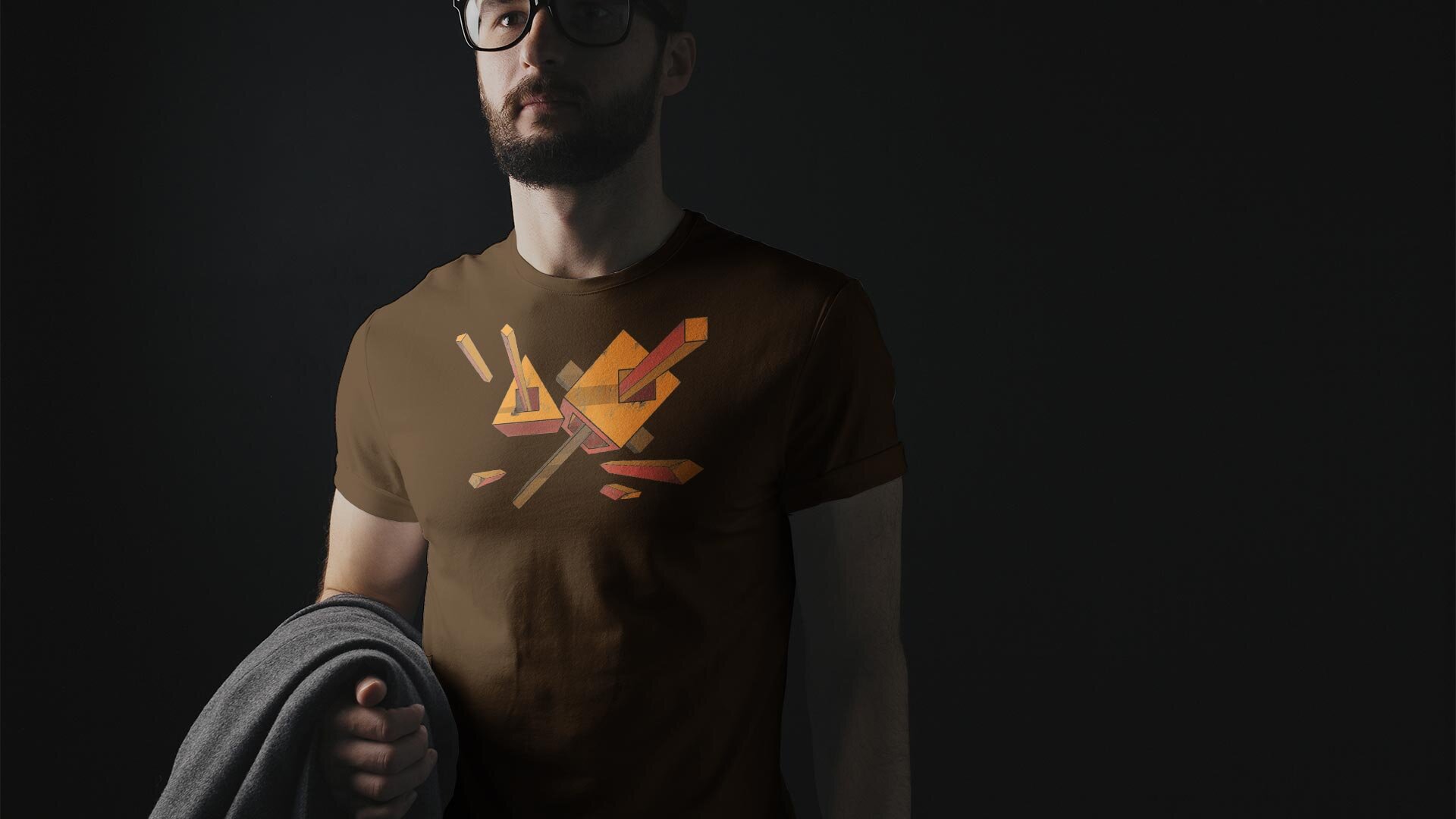
Chaperoned Extrusion (one-point)
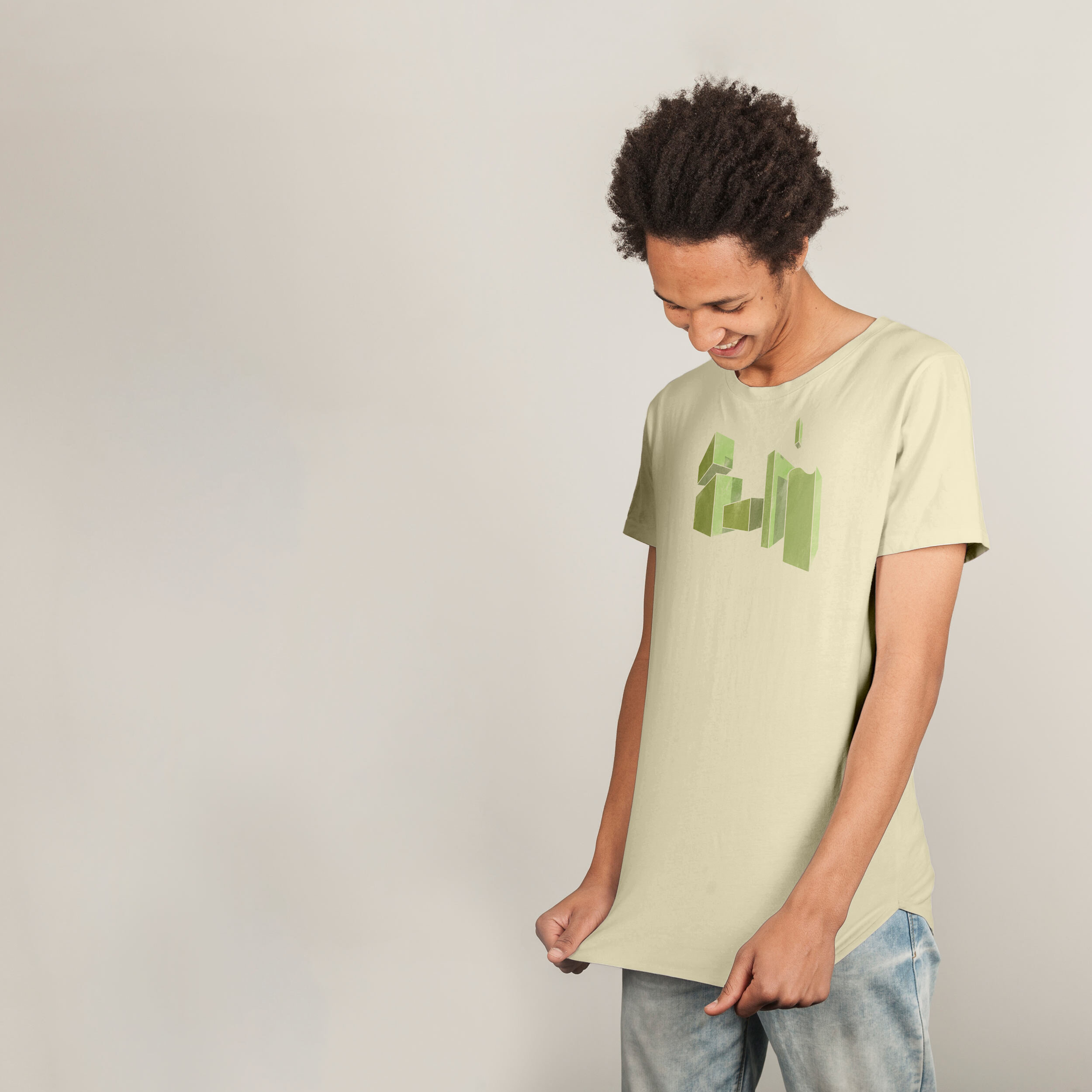
Promenade (two-point)
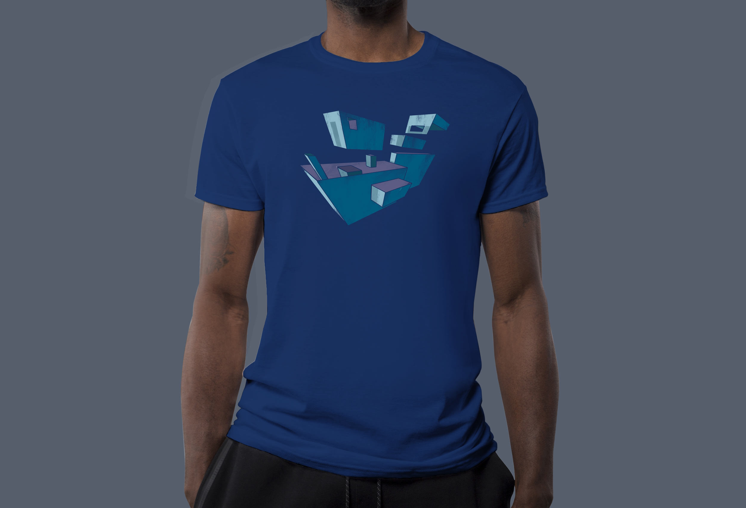
Appliances (three-point)
The process was somewhat frustrating (especially when trying to determine how shadows might be cast in these fantastical geometries), but definitely educational.
My next thought was to put each of these pieces on a t-shirt to see how marketable/fashionable they might be. What do you think? Would you buy/wear these? What do you think of the colors?


